Why is a well-designed impact report important?
A well-designed impact report is essential for organisations to communicate their achievements, transparency and accountability. The smarter the design, the more these aspects shine. Creative Manager Lydia Willcox dives in to how that can be achieved and why the visual appeal of an impact report really matters.
Make the impact worth it!
It’s important that your impact report design leaves a lasting impression. An attractive report can influence the way people perceive the company. For example, a consistent and strong brand identity conveys professionalism and credibility and could lead to greater support, collaboration, or potentially even investment. Adding to this, consistent use of branding elements, such as logos, colours, and fonts, reinforces the company’s brand image, contributing to positive and memorable brand recognition among readers.

Talking of professionalism and credibility…
A cleverly designed impact report screams professionalism and credibility. It reflects positively on the company, suggesting that the same attention to detail applied to the report is also applied to the organisation’s projects and initiatives. Good design also makes sure that the information needed to meet any relevant standards or regulations is clear and accessible throughout your report.
Engagement is key!
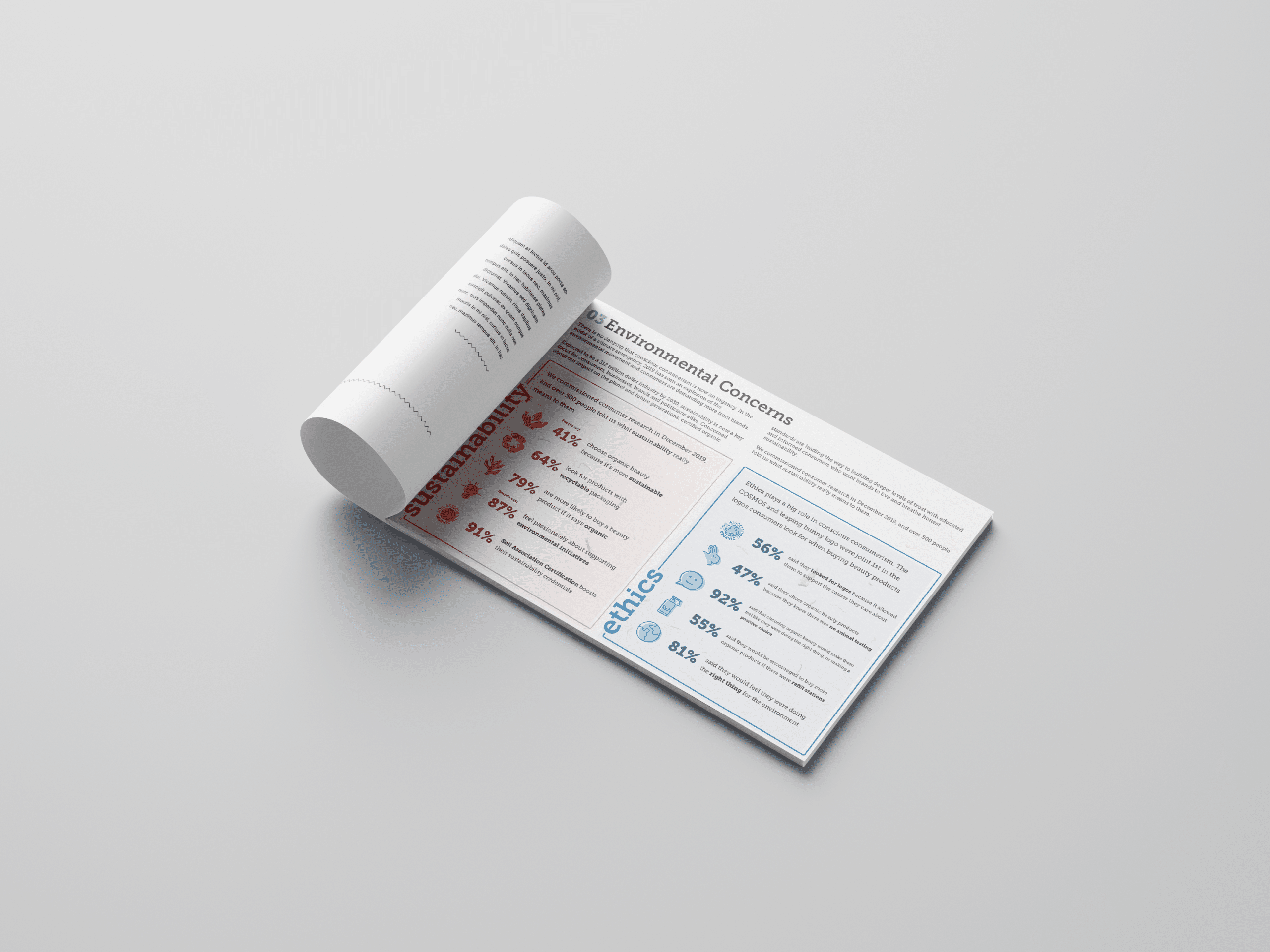
A visually pleasing impact report is more likely to engage readers and encourage them to explore the content further. Engaged readers are more likely to retain information, remember key details, and have a positive perception of the company. These days, impact reports often have to contain a lot of information. You want to make sure that large amounts of data, like a carbon footprint, are digestible for your audience but remain accurate. This is where well-designed data visualisations can be all the difference. Take a look at our other blog on different types of data visualisations to find out which is best for your information – Data visualisation – beyond the bar chart.

Telling a story with impact report design
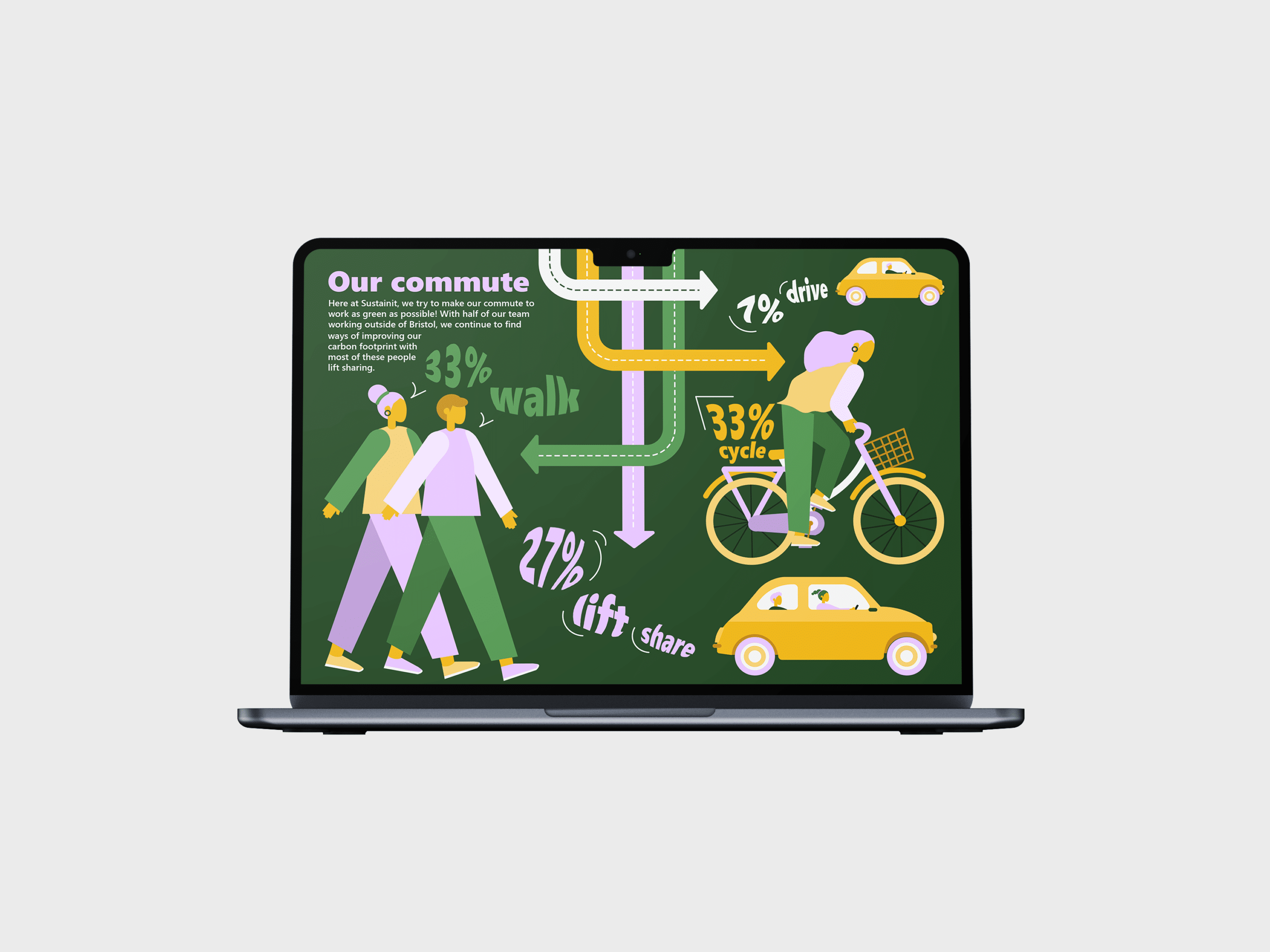
Design elements can enhance storytelling within the impact report. Engaging visuals, infographics, and well-chosen images can help tell a compelling narrative, making the impact and outcomes more relatable and memorable. This also makes information more accessible and understandable ensuring people are getting the most out of the report.
Impact reports have to appeal to a range of audiences – from the board room to concerned customers. Again, this goes back to taking complex information and transforming it to make sure it can be easily understood. A well-designed report allows you to tell your stories to a range of stakeholders, striking the balance between creative communication and professionalism according to your brand.
It’s good to be different
In a crowded information landscape, a visually attractive impact report stands out. This differentiation can be crucial for companies seeking to attract attention and maintain competitiveness, especially in industries where visual appeal is valued.
Impact report design goes beyond aesthetics. It plays a crucial role in capturing attention, engaging stakeholders, conveying professionalism, and positively influencing how the company is perceived.
