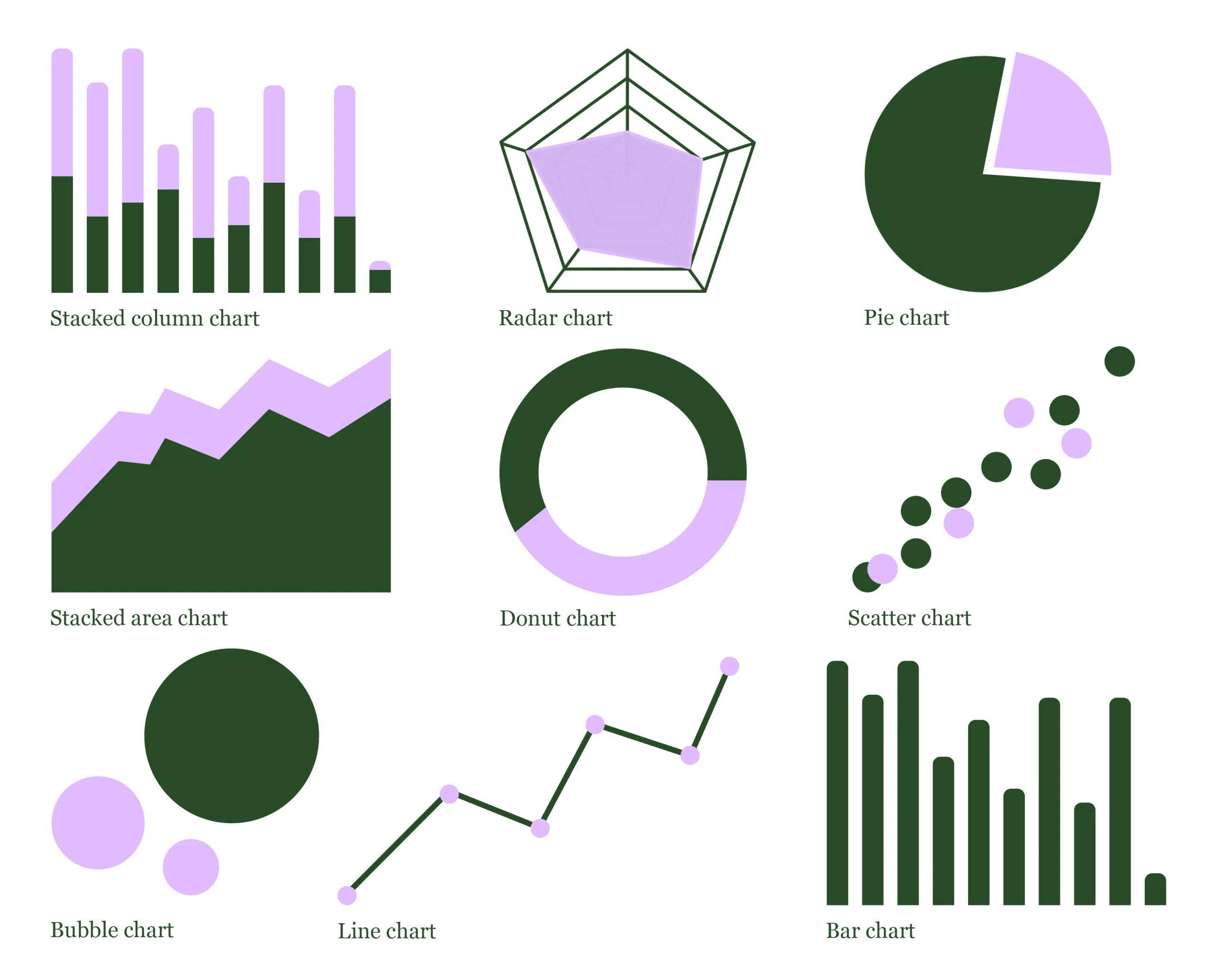
Types of data visualisation – beyond the bar chart
Data visualisation can be a lot more creative than people might think. There’s far more to it than just Excel tables – it’s a visual that stops you from scrolling and gets you thinking. And it’s an exercise that takes skill, combining graphic design, analytics and storytelling to inspire ideas and actions.
When thinking about data visualisation, the first thing that springs to mind for many is probably the bar chart. Whilst this can be a useful way of displaying information and might be perfect for simple data – there are plenty more ways to consider! That said, whilst its important to make charts aesthetically pleasing and displayed in your brand colours, you must ensure the data is still being accurately presented.
Read on to hear all about the different types of data visualisation, why each one has a different purpose and examples of design practices we would use to make certain data stand out.
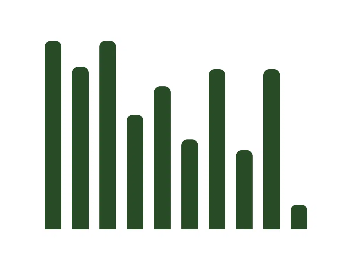
Let’s start with the bar chart:
- Bar charts are a simple and easy way to show which group of data is most common and making comparisons between categories. They’re also good for showing large data changes over time and when there are more than a few categories.
- The bar chart might seem quite dull, but with the right design choices you can this type of data visualisation super digestible. For example, using different colours to highlight patterns or data changing over time.
- Design best practice tip – use horizontal labels and start the y-axis at zero to make values easy to understand.
The stacked bar chart – similar, but with an extra layer:
- This is a really useful one to show how a larger category can be split into smaller subcategories. This makes these charts good for displaying lots of information at once.
- By using time as the x axis, you can also use a stacked bar chart to see how a group starts in one column and moves to another over a certain period.
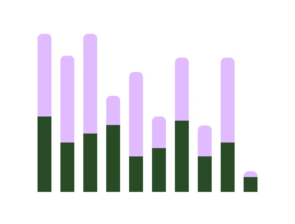
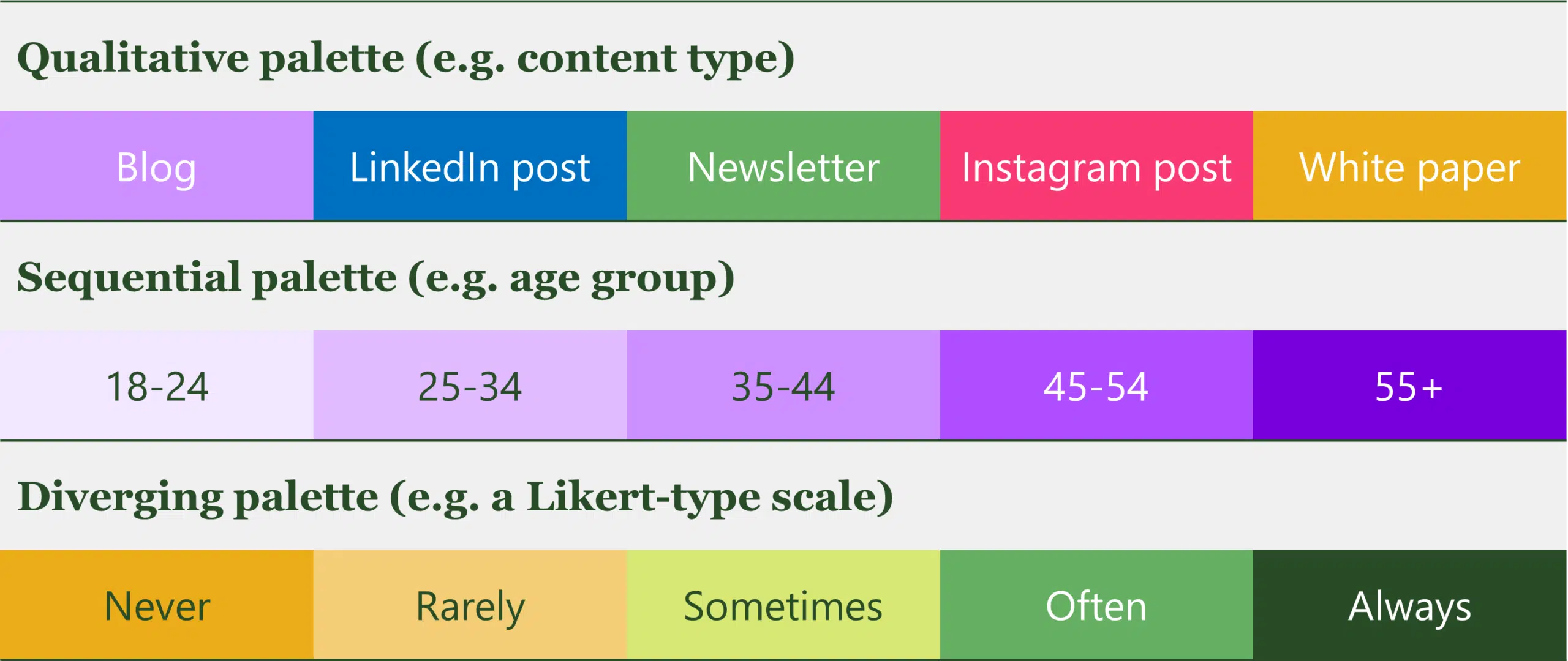
- Design best practice tip – Because of the different segments, stacked bar charts can be difficult to read. It’s important to have contrasting colours in this kind of data visualisation and make the scales large enough to show changes. Choosing a colour palette can dependent on your type of data – a qualitative palette for categorical variables, and sequential, or diverging for those with a meaningful order.
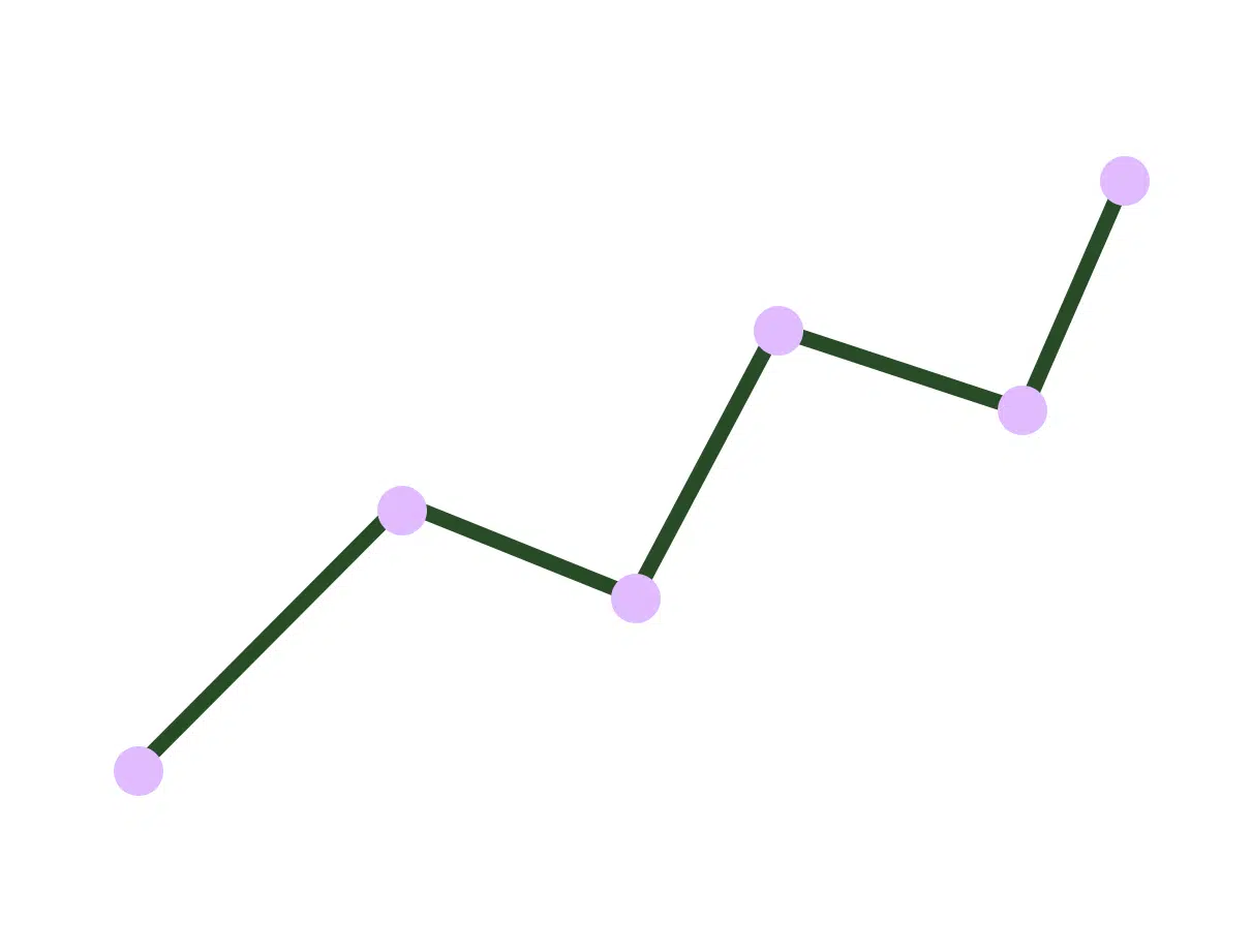
Classic line graphs:
- Line graphs are great for showing trends over time and making predictions based on history of the data. They should be used when your data is continuous.
- The scale on a line graph can also make a big difference on it appearance. An appropriate scale should ensure that it’s easy to see any changes in the data, without being misleading about their magnitude.
- Design best practice tip – If you wanted to compare two or more data sets, plotting more than 1 line is a great visual for this. It’s best to not plot too many lines to avoid confusion and make sure the colours are contrasting.
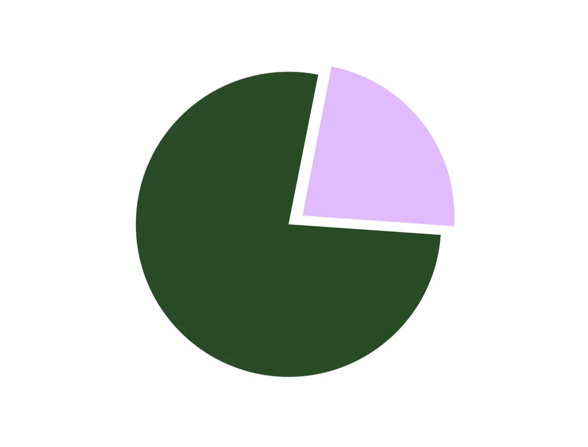
Pie charts – clear and visual:
- Possibly one of the easiest to understand, the pie chart conveys numerical proportion. The total sum of the pie chart slices need to equal 100% and it’s best to not illustrate too many categories to make sure there’s an obvious differentiation between segments.
- Pie charts can also give designers more freedom to be creative with different patterns, colours etc., to separate the categories.
- Design best practice tip – order the slices in a pie chart by size so that they can be quickly and easily interpreted, and the segments can be easily distinguished from each other.
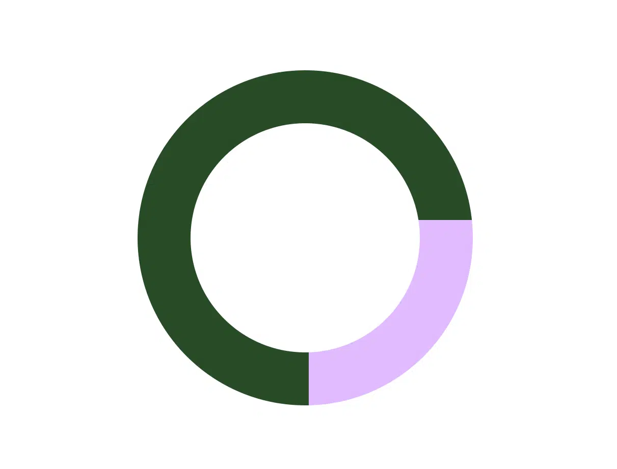
Readable donut charts:
- Essentially the same as a pie chart, the donut chart has (just like a donut, the middle cut out). This means that more categories can be displayed and still be readable. However, limiting your categories to 5 can be useful. If you have more, you can combine them into a segment labeled ‘other’ which you can explain elsewhere.
- The blank centre can also be used to display supporting data, a key takeaway statistic or the numerical total of the segments.
- Design best practice tips – segments should be ordered according to size, and should have a contrasting categorical colour.
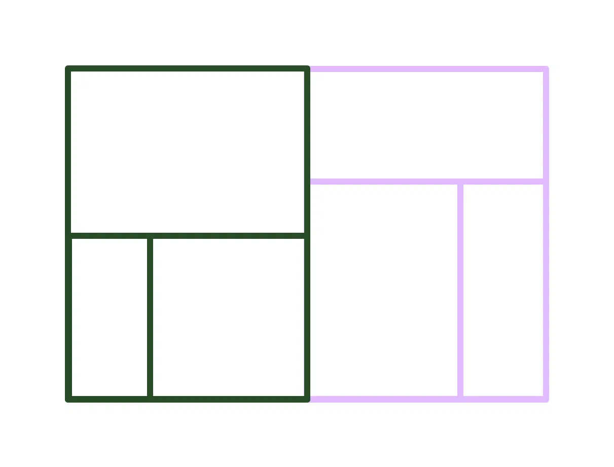
Intuitive treemaps:
- Treemaps represent hierarchical data, nesting boxes inside one another with size and colour representing the different dimensions. They are great at displaying the quantities of each category via area size but can use 2 quantitative values.
- They’re a great one to find information at just a quick glance, and make the most of a small chart space.
- Design best practice tip – Treemaps are very visual and intuitive to interpret, especially with the right use of contrasting colour – colour can represent measures (such as KPIs) or dimensions (such as categories).
Do you want to communicate a change through your data? Are you wanting to clarify an important point? Or perhaps you’re aiming to facilitate a comparison? The best way to do this is with a clear visual aid. A good data visualisation helps the reader quickly disseminate the key facts. You can read our previous blog post about the power of data visualisation to discover all the benefits of a strong visual.
These are just a few examples of data visualisations, there are so many more! Sometimes it can be tricky to figure out which is best for your dataset, and that’s where our creative team comes in. We can help you get the most out of a PowerBI dashboard, or add an extra artistic flair for reports and marketing materials.