To put it simply, data visualisation is the representation of information and data using visual tools like charts, graphs and maps. It provides an accessible way to communicate general trends and patterns in data and can help specific audiences understand data without needing the technical knowledge.
Read Time
3 mins
Author
Ethan Milligan
What does data visualisation really do?
Tells a story
Visualisation removes the noise from data and tells a story by highlighting the useful information which, in turn, improves comprehension, communication and decision making. It incorporates all angles of data and forms a complete picture that tells a story with a strong narrative and message.
Creating reports and dashboards in Power BI
When creating visualisations there are potentially more things to consider that meets the eye. While it can be rewarding and satisfying to create a compelling looking dashboard, here are what I would consider to be the more important areas to consider:
Keep your audience in mind
From a presentation and understanding point of view, it is paramount that those you are showing your reports to are gaining maximum value out of them. When creating reports, a vital ingredient is thinking about how the data is going to be perceived by a range of technical and non-technical audiences. No matter how good an understanding someone has going into a presentation, they should ideally come out of it with the same level of understanding as those more technical than them!
Show your audience what you want them to see
You can make the experience a lot more comfortable for you audience by guiding the way through your visuals. There are two core practices that can be implemented in a report that can make the experience a whole lot more digestible for your audience:
Guide the audience and show them only what you want them to see from a visual. If you have a bar chart with an exceedingly high value, and you want to draw attention to it, perhaps think about how you can do this within the visual, maybe by giving the value an abruptly different colour, so there is no option to be drawn to it?
Treat the dashboard like a roadmap! Creating a hierarchy with your visuals is a good way of portraying a sense of importance within them. Two ways you can do this are through size and location, if a there is a visual with high importance, make it noticeably bigger than others! The same idea can be used for location, when looking at a dashboard, users tend to look at it in a zig-zag format, going from top right to bottom left. With this information you can tactically place your more important visuals at points on the page that will get more attention.
There should be a rigid structure to the data you are presenting. You want to ensure the end user is drawn to the most important information, whether that’s by location on the screen, or by making the data stand out in comparison to the rest, there are clever ways to achieve this.
Simplifies information
Some forms of data may be hard to interpret and important information could be missed. That’s where data visualisation comes in! It allows the audience to focus on the information that’s deemed more important and portrays the patterns and connections that shouldn’t go unnoticed. Colours, shapes and patterns are examples of visual cues that allow the brain to absorb information quickly. This means that looking at a visualisation, instead of a table of numbers, avoids confusion and holds people’s attention. It makes the important bits digestible.
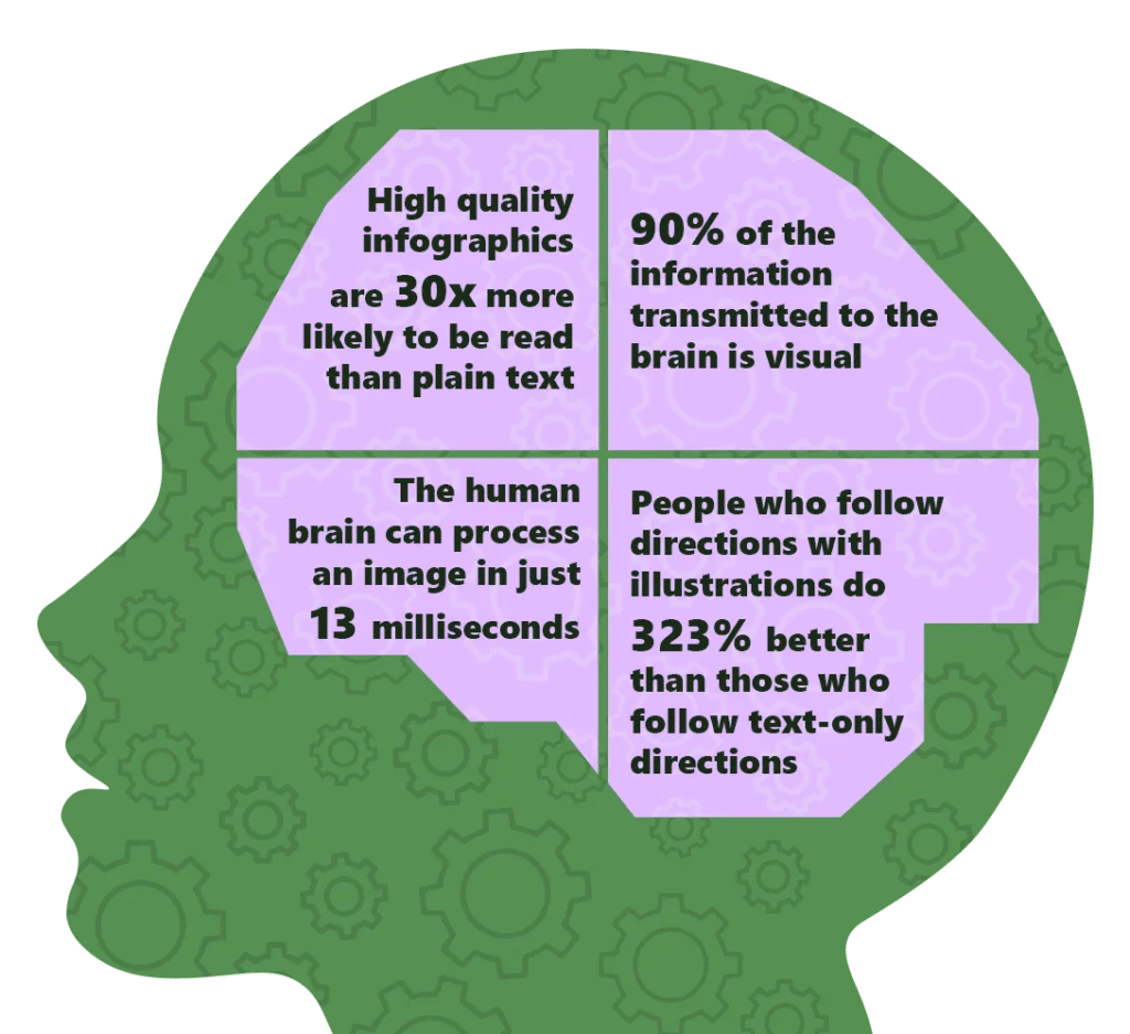
Now, it wouldn’t be a Sustainit blog without some data to back it up!
I’m sure when you think of data vis your first thought is just charts and graphs. It doesn’t have to be though! Illustrations and graphics can also be a good way to communicate your data. Take the London Underground map for example. Colours and labels are used to differentiate the different tube lines and unnecessary detail, such as geographical accuracy, is avoided to ensure simplicity.
Throughout all of this, accessibility is a really important factor to incorporate. Using colour in data visualisation is a great way to portray an important pattern or trend, but it’s important to be mindful of using colour combinations that people with colour-blindness can interpret and use patterns or labels to distinguish different categories alongside this.
How can we help you?
Data is one of the most powerful tools for communication. But numbers alone won’t necessarily make the desired impact if your audience doesn’t understand them. That’s why data visualisation is key and should be incorporated into your sustainability strategy at the outset. Get in touch to find out how we can help your organisation.